Project Overview
As part of my PGDM coursework and building on my experience at Assis Tech Foundation,
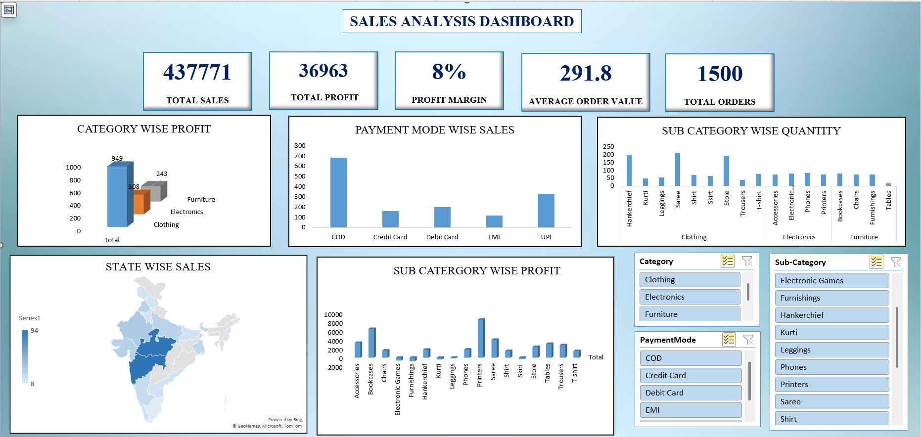
I designed a comprehensive Sales Analysis Dashboard to help businesses track revenue trends,
product performance, and key performance indicators (KPIs). The dashboard consolidates
data from multiple sources into a single interactive view, replacing static Excel reports
with dynamic Power BI visualisations.
This project demonstrates my ability to clean and structure raw data, design meaningful KPIs,
build interactive dashboards, and deliver actionable business insights — skills I developed
during my internship at ATF where I built 5+ operational dashboards.
Key Results
5+
KPI Cards
5
Interactive Charts
4
Regional Views
30%
Faster Reporting
Problem Statement
- Sales data was scattered across multiple Excel sheets with no unified view
- Manual reporting was time-consuming and error-prone
- Management lacked real-time visibility into revenue trends and product performance
- No ability to filter and drill down by region, category, or time period
- Decision-making was based on gut feeling rather than data-driven insights
My Approach
Phase 1: Data Collection & Cleaning
- Collected raw sales data including order details, product info, regional data, and sales rep records
- Cleaned and validated data using Advanced Excel — removed duplicates, fixed formatting, standardised categories
- Applied techniques from my ATF internship where I cleaned 1,000+ records improving accuracy by 25%
Phase 2: Data Structuring & SQL Queries
- Structured data into a relational format with orders, products, regions, and sales rep tables
- Wrote SQL queries for aggregations — revenue by region, category-wise sales, monthly trends
- Used SQL joins to combine product, region, and sales data for dashboard consumption
Phase 3: Dashboard Design in Power BI
- Designed KPI cards for: Total Revenue, Gross Profit, Total Orders, Average Order Value, Profit Margin
- Built interactive charts: Revenue trend line, Regional doughnut, Category bar chart, Quarterly YoY comparison
- Added filter slicers for Region, Year, Quarter, and Category
- Created data tables for Top Products and Sales Rep Performance tracking
Phase 4: Insights & Presentation
- Identified that the North region outperformed others with 22% YoY growth
- Discovered Electronics category contributes ~39% of total revenue
- Found month-to-month growth dipped in July-August (seasonal pattern)
- Presented findings with actionable recommendations to faculty/reviewers
Tech Stack
Power BI
Advanced Excel
SQL (Joins, Aggregations)
Pivot Tables
VLOOKUPs
Data Cleaning
KPI Tracking
Data Visualisation
Sample SQL Queries Used
SELECT
region,
SUM(revenue) AS total_revenue,
COUNT(DISTINCT product) AS products_sold,
SUM(profit) AS total_profit,
ROUND(SUM(profit) * 100.0 / SUM(revenue), 1) AS margin_pct
FROM sales
GROUP BY region
ORDER BY total_revenue DESC;
SELECT
FORMAT(order_date, 'yyyy-MM') AS month,
SUM(revenue) AS monthly_revenue,
SUM(profit) AS monthly_profit
FROM sales
GROUP BY FORMAT(order_date, 'yyyy-MM')
ORDER BY month;
Dashboard Components
| Component |
Purpose |
Visual Type |
| KPI Cards (5) |
High-level metrics at a glance |
Revenue, Profit, Orders, AOV, Margin |
| Revenue Trend |
Track monthly revenue & profit |
Line Chart with area fill |
| Regional Breakdown |
Revenue distribution by region |
Doughnut Chart |
| Category Analysis |
Compare product categories |
Horizontal Bar Chart |
| Top Products Table |
Best sellers with margin & trend |
Sortable Data Table |
| Sales Rep Tracker |
Target vs actual achievement |
Table with Progress Bars |
Key Learnings
- Clean, validated data is the foundation of every good dashboard — learned this at ATF
- Power BI filters and slicers make dashboards truly self-service for stakeholders
- Combining SQL for data prep with Power BI for visualisation is a powerful workflow
- KPIs should always tell a story — numbers without context are meaningless
- Interactive dashboards reduce manual reporting effort by 20-30% (validated at ATF)
Related Certifications
- Advanced Excel — Pivot Tables, VLOOKUPs, Dashboard Development
- SQL Certification — Joins, Data Extraction, Aggregations
- Bloomberg Market Concepts (BMC) — Financial Data Analysis
Interested in this project?
Let's connect and discuss data analytics, dashboards, or business insights.
Get In Touch
Next Project